In the US. and in Canada, 30-40% of the food supply is wasted, equaling more than 20 pounds of food waste per person per month, yet millions go hungry night after night.
Kai is a small start-up based in Chicago dedicated to ending world hunger once and for all. Their long-term plan to eradicate hunger worldwide began in 2013.
ROLE & DURATION
UX/UI Designer
Branding
Prototype and testing
80 hours
Goal
To design an app to donate food and funds, request service for those in need, while members of the organization can organize their logistics and events.
To create a memorable branding.
NOTE
This project is completed through Designlab’s UX Academy. This is not a real app, but the research and testing are true in combination with a mentor and fellow student feedbacks.
01. DISCOVERY
RESEARCH
While doing secondary research and understanding the nonprofit organization, I decided to do a comparison to gauge strengths and weaknesses.
I interviewed a few people who volunteer regularly to discover organizational procedures for accepting and distributing donations, as well as people who have donated online to understand their motives.
RESEARCH COMPONENTS
Secondary research
Comparison Analysis
Experience Interview
During my experience interviews, here are some perspectives I’ve learned:
People are aware of the food waste issue but still discard food often
People give donations because of an emotional connection
People donate as a one-time monetary transaction and no loyalty from any organization
Having a familiar brand is beneficial
There are no concerns when donating money and people are happy to help
People do not tracks their donations
02. DEFINE
Next, I developed user personas that would represent the users during my research phase. I will be referring back to these personas throughout the project to help me keep focus on the goals.
USER PERSONAS:
A. KAI staff who needs to keep things organized
B. Cafe-bakery manager who has a partnership with KAI
C. The generous donor
Nicole (persona A) was a bit challenging for me, so I created an emotional journey map to connect and dig deeper into her perspective to empathize with her.
Below are the project goals:
TASK FLOW:
I then created a task flow for each personas to refer back while creating my wireframes.
03. IDEATE
Up next is Information Architecture! This will helps users spend less time and effort searching for information to have a well-designed and user-friendly app.
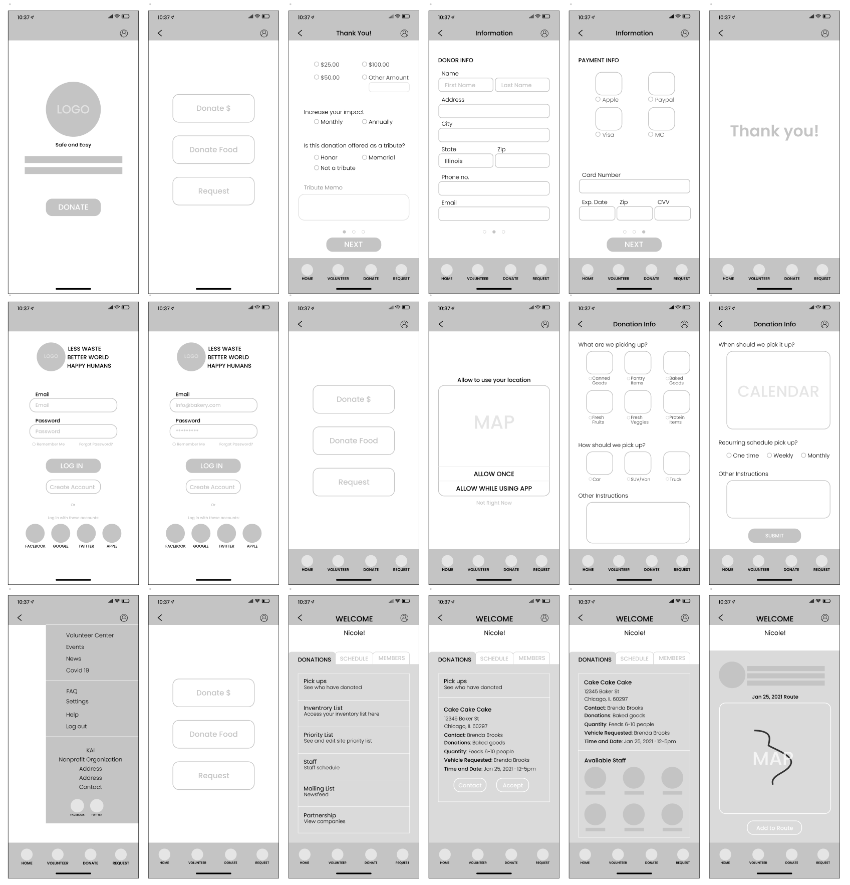
Once I worked out the typical task flows, I created the lo-fi wireframes while keeping in mind the thumb zone on mobile devices.
Low-Fidelity Wireframes:
04. DESIGN
Branding
The goal is to have a memorable branding that evokes emotions through colors. The main color orange attracts users to take action as it is an energetic color while blue, a complementary color to orange, that is trusting and has a calming effect.
Logo: The leaves represent “reducing waste” while the fork represents “feeding hunger”
High Fidelity Wireframe
Now, it’s time to put all the hard work together! The hi-fi wireframe with prototype was created on Figma. Feel free to click through my prototype here! While doing so, keep these tasks in mind:
Donating funds to Kai annually.
Logging in to the app to start a weekly pick-up schedule.
Accepting a donation and delegating it to other volunteers.
Donation Form
Log-in Screen and Donation Process
Drop Down and Volunteers Pages
05. VALIDATE
USABILITY TESTING
I asked my participants to go through the tasks one at a time and requested them to think out loud while going through the app.
Task Description 1
Donating funds to Kai annually.
Task Notes
Participants can navigate the information forms quickly.
Task Description 2
Having a partnership with KAI, log in to the app to start a pick-up schedule weekly.
Task Notes
Another easy task that all participants went through quickly.
Task Description 3
As a member of Kai organization, a notification has come through. You need to accept the donation and assign it to other volunteers.
Task Notes
All participants were able to assign the pick up easily. However, they were curious about the other tabs and their functions.
Task Completion Rate
100%
Task Completion Rate
100%
Task Completion Rate
97%
Overall Feedback:
All participants likes the ui design and the branding is distinct!
My take on this project
This project was a little bit overwhelming at first since I did not know anything about nonprofit organizations. I invested time to understand the industry and help me create a smooth user experience on the app. This was an enjoyable project, and I have learned about nonprofit organizations, I feel compelled to donate.


