A non-profit organization based in Plano, Texas that offers financial tools to help with financial literacy for everyone, of any age or status.
Role: User Research | User Experience | User Interface | Handoff to the developer
Materials: Trello | Whimsical | Miro | Optimal Workshop | Figma
Techniques: Organization Analysis | User Interviews | IA Audit | User Flows | Site Map | Card Sort | Wireframing | Usability Testing
Teams: Toni Rosati, Anna Drinka, Matt McLaughlin, Ryan Manalastas, and Thelma Idiong
Year: 2021
Duration: 2 months
Scope: Information Architecture | Website Redesign
DISCOVERY
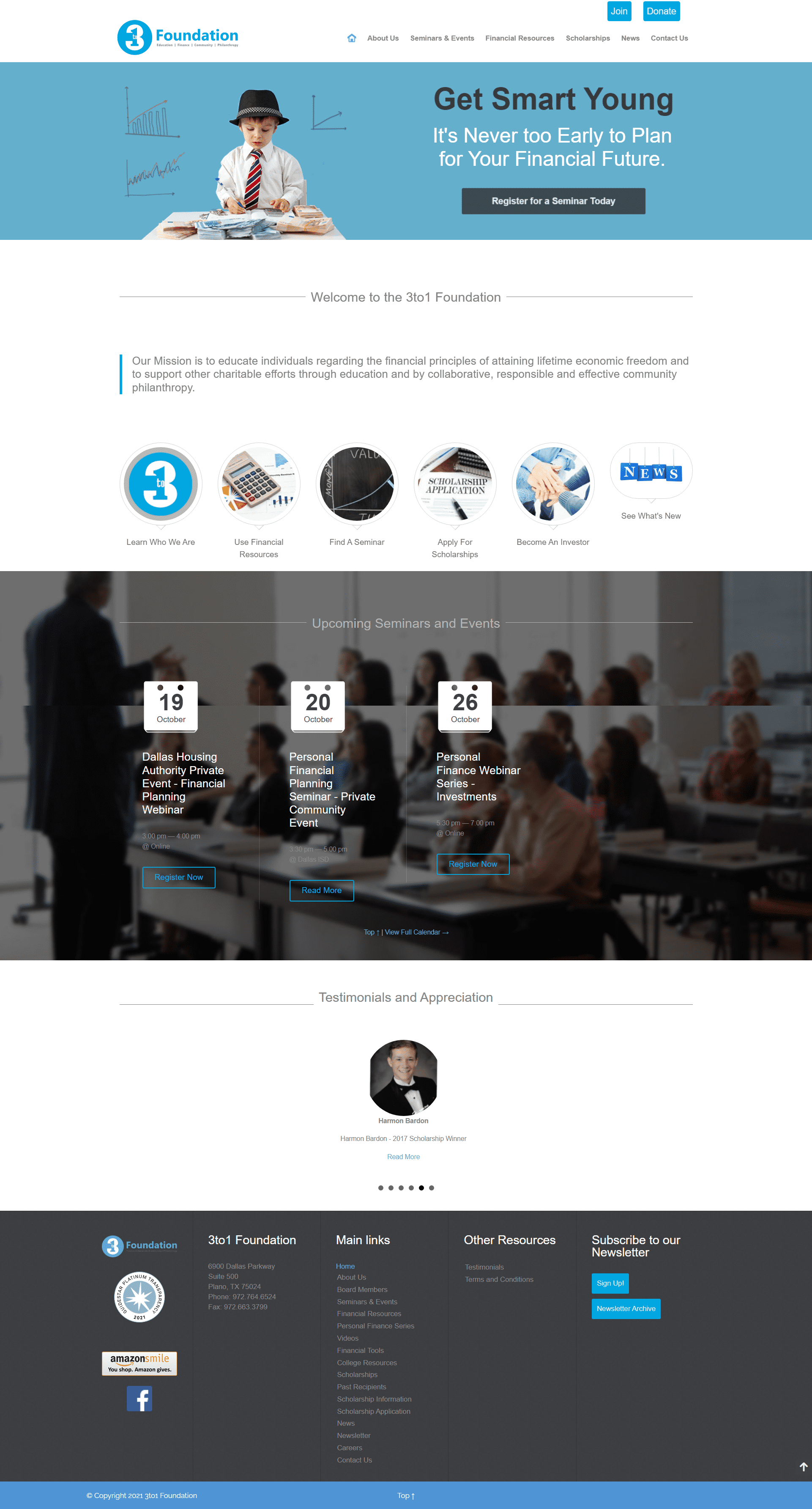
Before meeting the client, I prepared myself by doing an initial site walk-through of the site.
And here are a general few notes:
unclear of the product and services
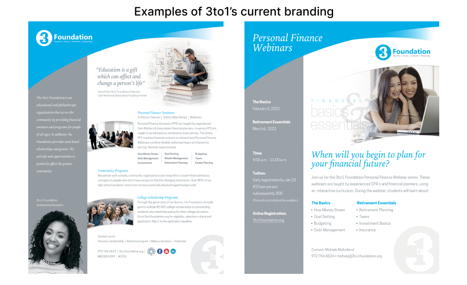
untrustworthy due to branding inconsistencies and heavy use of stock images
discrediting due to confusing word choice
disorganized Information Architecture
several UI inconsistencies
missing visual hierarchy
But of course, these are just initial audits. It is better to know what the client is looking for and to understand the issues and goals before going into action.
By being prepared, we are ready for our first meeting!
After the first meeting, here are our discoveries and their requests:
Showcase
programs offered
scholarships
organizations milestones
Appeals to
donors for funds
easily become a volunteer
Looking for
better aesthetics
clear mission
DEFINE
A couple of volunteers from the organization were willing to participate in our user research.
Here is the link to our script.
With the lack of volunteers, the team gathered and brainstorm how to approach this project effectively. Several ideas were considered such as:
Card sorting - to understand what action words work best
Qualitative interview - few but into depth
Tree jack testing - for the site map
We decided to proceed with Tree jack testing through Optimal Workshop. This way, the users will be unmoderated and can collect clear data.
Persona and User-flows:
College Students desiring scholarships:
understandable journey to the scholarship application
clear resources and information
minimal information
New visitors interested in financial literacy:
easily navigated to all financial tools
clearly see upcoming events
less overwhelming information
trust-worthy branding
IDEATE
Tree jack testing and result
17/21 questions regarding navigation were correct
the most question with friction was:
where can you find the option to become a paid member?
57% of testers got this wrong
this feature is a significant flow for the product that needs to be resolved
a surprising discovery was that the word ‘give’ instead of ‘donate’ was confusing to the users
If you would like to access the questions and see the results for the Treejack, click here for the link.
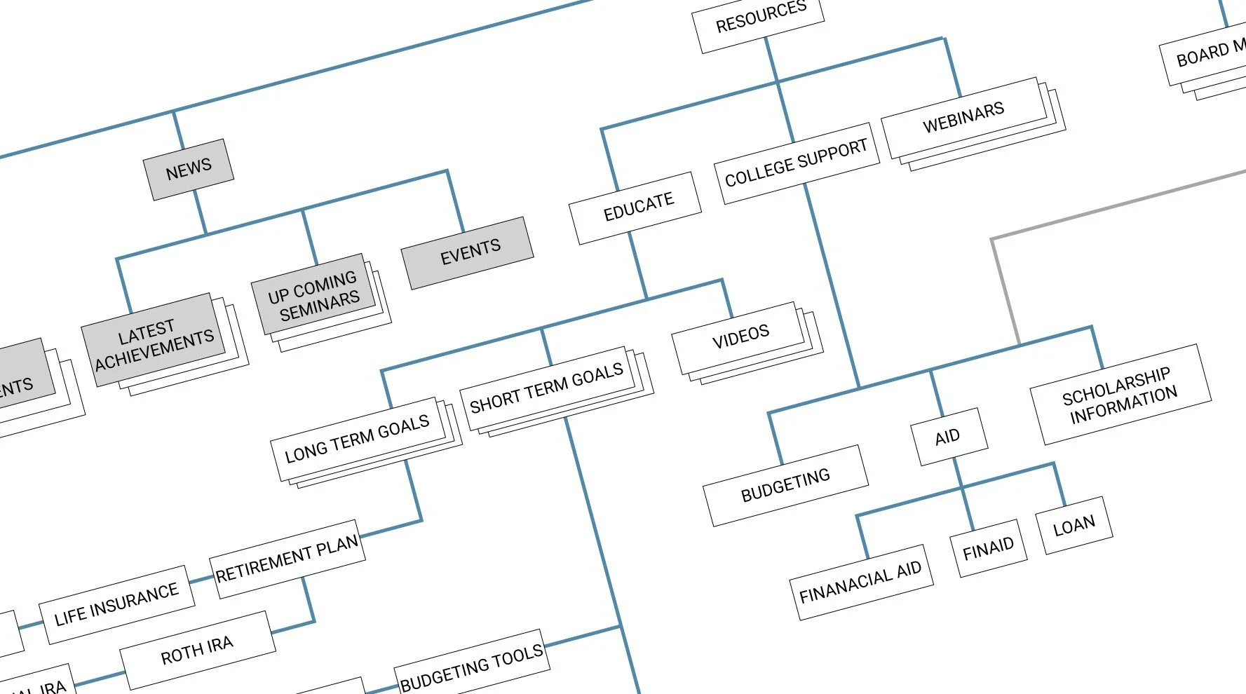
Applying the insight from the tree-jack testing, we fine-tuned the information architecture. Below is a little snippet of the IA.
CREATE
To tackle the home page content, the hierarchy approach was to answer these questions:
Who - they are
What - they do
Show - their product
Prove - that they are experienced
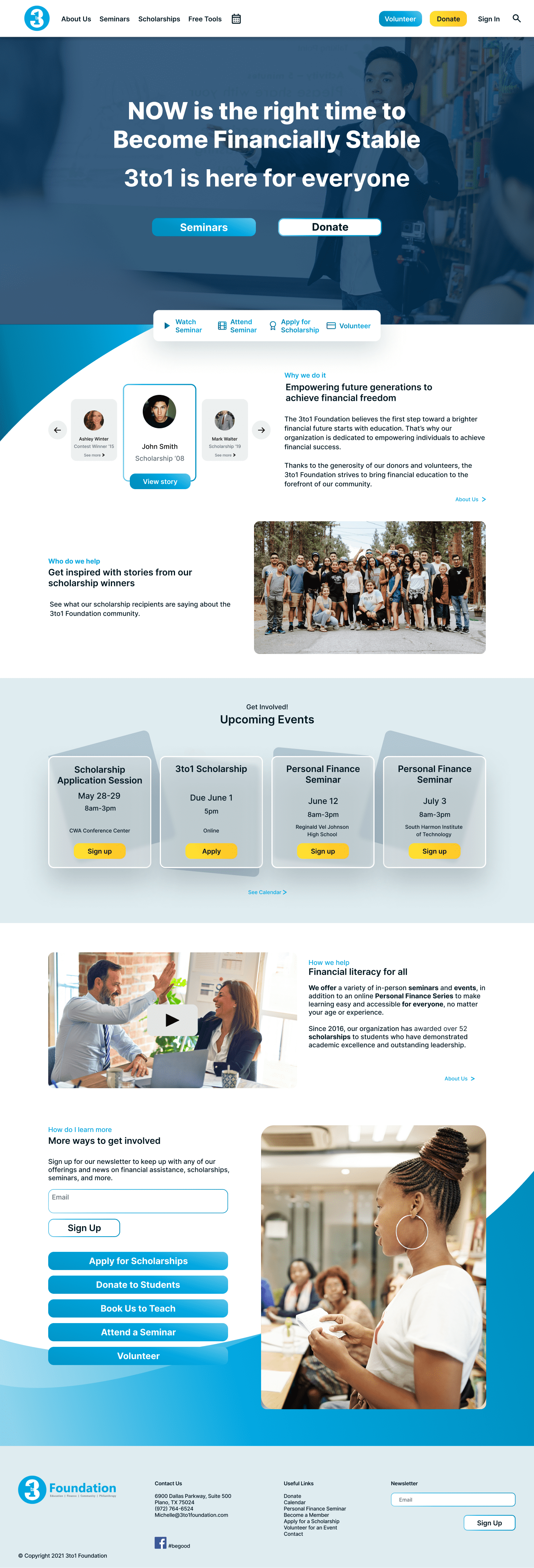
Below is our first design. I know, I know! It is a little too much!
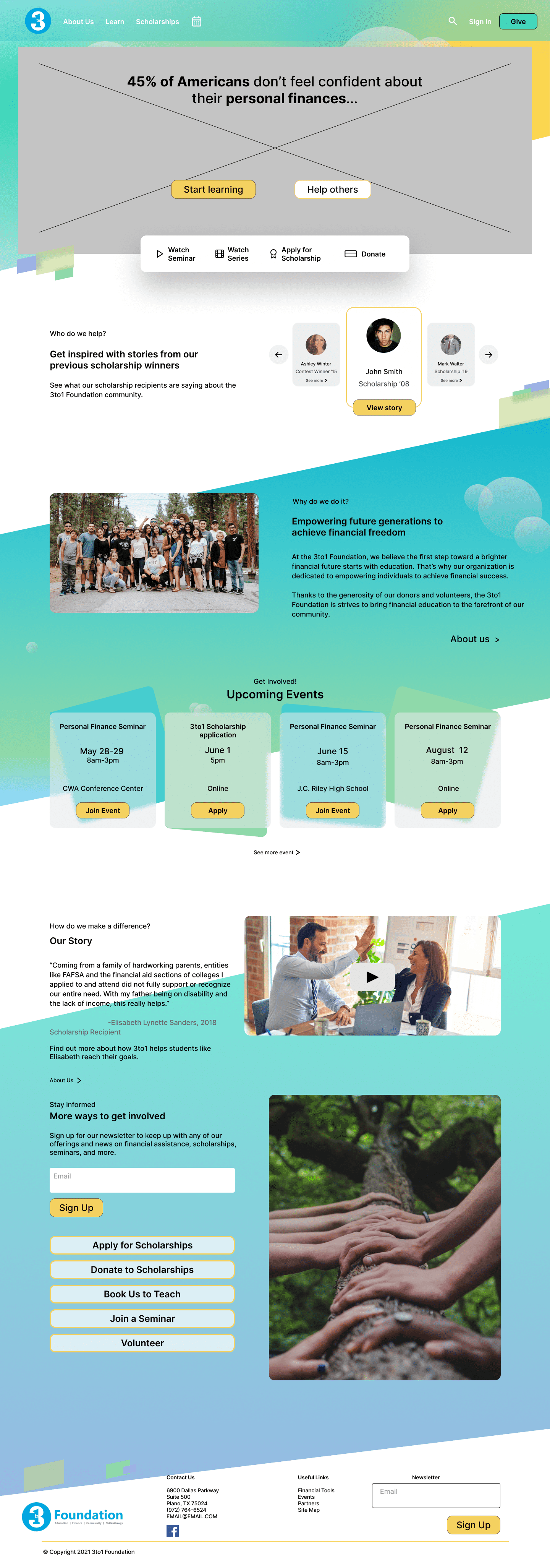
Click here for the usability testing.
With the script ready on hand, we asked the participants to accomplish a few tasks:
Become a volunteer
make a donation
booking a speaker
and look for a financial calculator
TESTING
UI felt trendy
UX flow is better and easier to navigate through the site
Few of my takeaways:
always be prepared to ask the right questions from the beginning can save up time
ask for clarification at all time, especially for a complex product
it is important to not manipulate an interview/research session for genuine data
design hypothesis does not always work out, so always test!
new UI trend is not the way to go; always think about the target audience

