ROLE
UX/UI Designer
Research, Prototyping, and Testing
DURATION
80 hours
GOAL
To add a new feature on Anthem Blue Cross's existing site by having a least-contact approach in healthcare. Introducing an all-in-one go-to site for medical records.
SOLUTION
To securely view and share medical information with professionals. And to add a calendar for tracking appointments and doctors’ notes during visitations.
NOTE
This project, I completed for Designlab’s UX Academy. This is not a real feature for Anthem Blue Cross but the research and testings are true, in combination with a mentor and fellow student feedbacks.
01. DISCOVERY

RESEARCH
I began conducting secondary research by looking into Electronic Medical Records (EMR) and finding opportunities by looking into their strengths and weakness
During the interview process, the goal was to identify pain points when accessing and sharing medical records and to gather feedback regarding personal data access.
RESEARCH COMPONENTS
Secondary research
Provisional Personas
User Interviews
Competitive Analysis:
After conducting user interviews, and discovering common goals and pain points, I found out that people want to be as transparent as possible. And some of what has been said are:
medical sharing among professionals will be helpful “so they can be all on the same page”
“I don’t fully understand medical terms”
“I just try to remember my conversations with my doctors”
02. DEFINE

Taking what I have learned from my research, and keeping in mind these new features, I created a user persona that would represent the users to which I will be referring back during the design process to keep me aligned with the goals.
User Persona
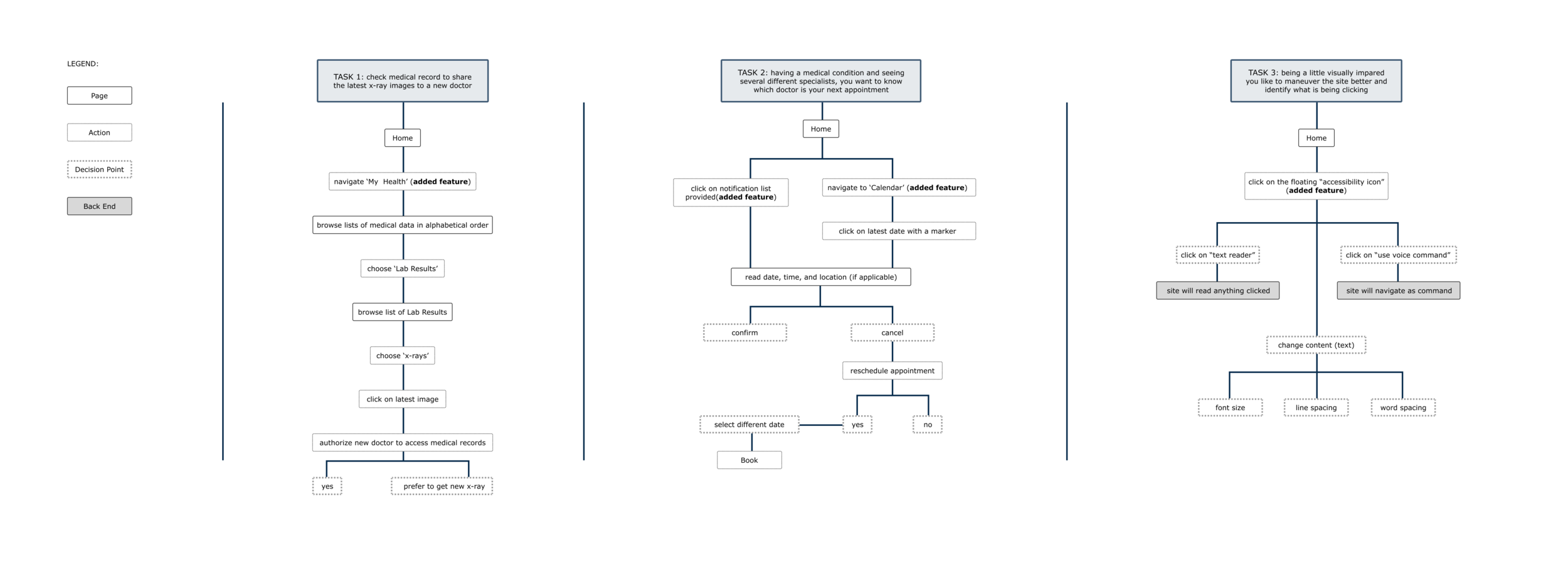
Task Flows
The next challenge was to figure out how and where to implement this new feature and to keep the focus on the user end and not on the medical profession end.

03. IDEATE

Once I worked out a typical task flows, I created low-fidelity wireframes of the sitemap.
The challenge here is to use the current layout and existing design patterns.
Low-Fidelity Wireframes:
04. DESIGN

High Fidelity Wireframe
After creating the low-fidelity wireframe, I then created the high fidelity and continue using Anthem’s brand identity. The medical tabs were an additional interface that was inspired by a paper folder that was often used in medical offices.
05. VALIDATE

TEST
The testing was conducted via zoom and asked my participants to go through the task one at a time. I requested for them to think out loud while going through the site.
Task Description 1
Your new out-of-network doctor would like to see your latest x-ray images. How would you share this data?
Task Notes
With memorability design, most users went through the navigation tabs to access their documents. There was a little friction in identifying ‘summary’ and ‘documents’ under the tab lists. All participants shared all their data instead of or going through the specific data requested.
Task Description 3
Having bad eyesight and cannot find your glasses but in need to check something on the site now, how would you approach the website?
Task Notes
Out of all three tasks, surprisingly, this has the most friction. Since it is still a new concept, not all know what the accessibility tab does. But once studied, the user found the accessibility useful for others in need.
Notes:
The icons on the homepage which is an existing feature on Anthem’s interface were hardly used at all.
Conclusion
Most people are unaware of their health and having access to their records will be helpful. The calendar feature was a success but it was surprising to know that people are not as willing to link it to their calendars.
My challenge for this project was to focus on the user’s perspective as I kept on considering the medical profession's perspective as well. But keeping in mind Pamela (my persona) helped me to stay focused on the project goal.
Another takeaway for this project is creating a mid-fidelity wireframe with no color as it helped me focus on the content instead of the UI. Since it was an existing brand, it was easy to add the UI to the high-fidelity prototype.
Task Description 2
You actively consult with several doctors and you want to know who, where, and what is your upcoming appointment.
Task Notes
There was no issue for all participants to locate the new calendar feature, and there was no friction in finding out their next appointment. The notification center was a success as all participants clicked the calendar to access it. Surprisingly, none of the participants wanted to link their appointments to their personal calendars but would rather send a text reminder.
Task Completion Rate
80%
Task Completion Rate
94%
Task Completion Rate


