

Intraverse is the first time travel service product. It encourages small groups to experience a memorable moment with like-minded people either with friends, family, or someone new.

OVERVIEW
A subsidiary of Richard Branson’s Virgin empire, Intraverse is an e-commerce responsive website that provides trip packages, customizable expeditions, and the best rate for small groups.
ROLE & DURATION
UX/UI Designer
Branding
User Research
User Testing
Prototype
12 Weeks
GOAL
To create a product strategy for the travel company that allows browsing through different time periods and destinations and encourages group travel.
SOLUTION
Empowered by user research and testing, create a responsive website to offer a time travel experience.
NOTE
This project was completed for Designlab’s UX Academy. Intraverse is a fictional travel company but the research is authentic. The design is based on real research, testing, and in combination with my mentor and fellow student feedbacks.

01. DISCOVERY
• User Interviews
• Personas

02. DEFINE
• Site Map
• User Flow

03.IDEATE
• Low Fidelity
Wireframe

04.DESIGN
• Branding
• UI Kit

05.VALIDATE
• Usability Testing
• Iterate
01. DISCOVERY

RESEARCH
Uncover the needs, desires, and pain points when booking trips on different platforms
Determine and analyze industry direct and indirect competitions and find opportunities
Define the minimum viable product by conducting interviews
Develop a user persona to refer back throughout the project
COMPETITIVE ANALYSIS
Defining competitions helped identify strengths, weaknesses, and find opportunities that could be utilized to mold the project.

EMPATHIZE
FEW INTERVIEW QUESTIONS
Do you prefer to travel alone or in groups? Why?
Take me to your best and worst booking experience. What do you love/hate about the process?
How can the booking experience be better?
If time travel time exists today, where and when would you go? Why? What will be your main concerns?
FINDINGS
Price was the dominant drive in booking trips
A small group to travel with was preferred to share experiences together
Destinations were premeditated for a few months
Day by day itinerary was strongly suggested
A requirement for customizable packages to accommodate different schedules
DESIGN DECISIONS
Discount on groups booking
Built-in chat to find groups to travel with
Create an itinerary to share and collaborate with others
Wishlist categorization to organize later trips
Ability to book individual or multi-day tours for customization
History overview of available destinations to gain more knowledge of its culture
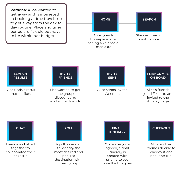
USER PERSONA
From my interview, a user persona was created to represent all of them.

EMPHATY MAP

02. DEFINE

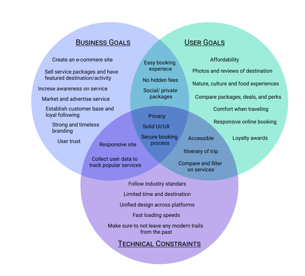
DEFINE BUSINESS AND USER GOALS
Illustrated below are the business goals, user goals, and technical constraints.
INFORMATION ARCHITECTURE
Using the findings from my research, the site map, task flow, and user flow were constructed in order to map out the site that is logical and is easy to navigate.
SITEMAP

TASK FLOW
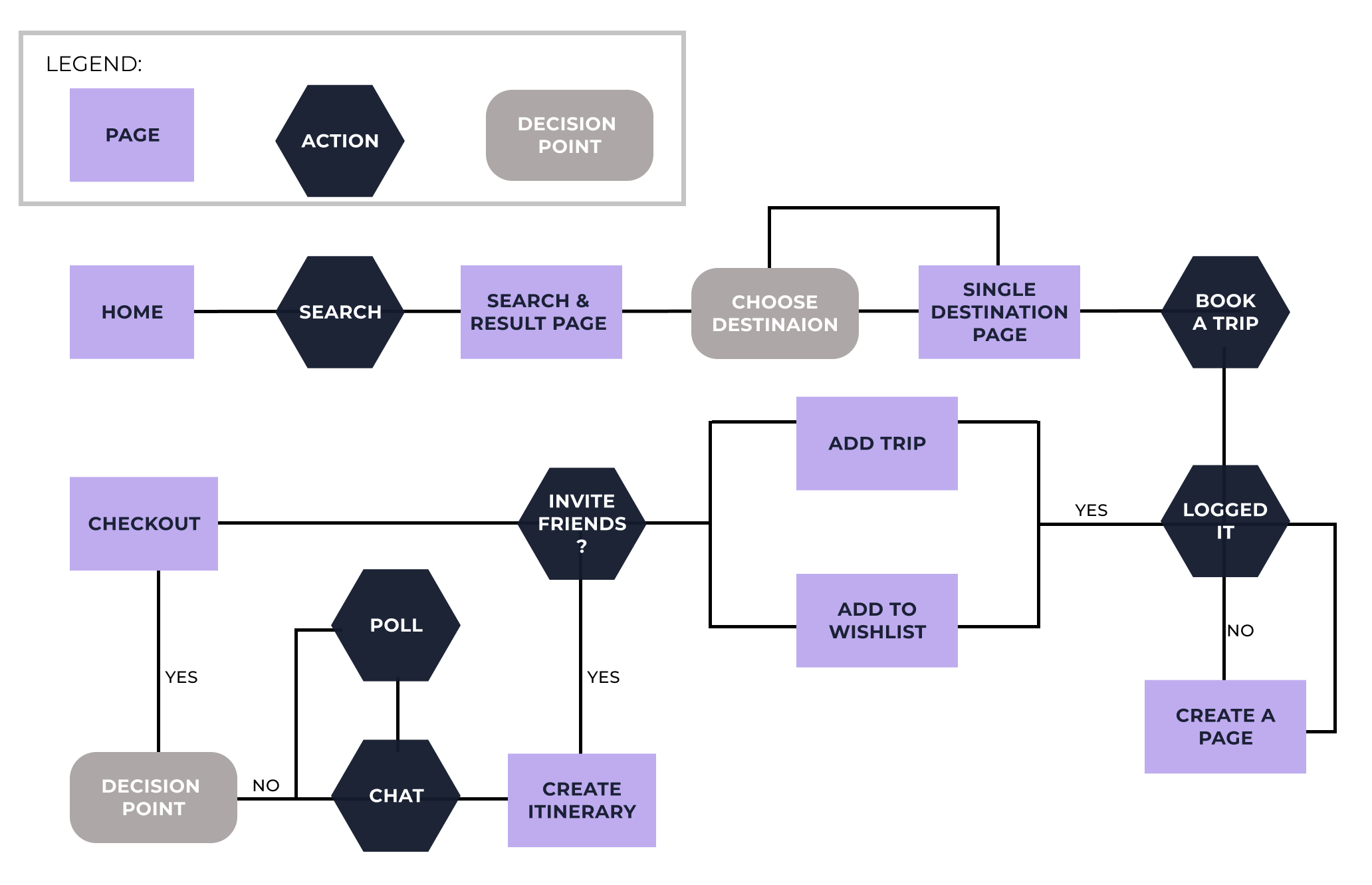
USER FLOW
03. IDEATE

INTERACTION DESIGN
The research and components I’ve collected at this point can now indicate how the site will be used and how the interaction will flow on the site.
This phase of the project involved creating mid-fidelity wireframes.
HOMEPAGE

SEARCH RESULT PAGE

POP-UP CHAT BOX

SINGLE DESTINATION PAGE

CHECKOUT PAGE

04. DESIGN

USER INTERFACE
Next, was to come up with the product branding. Keywords to keep in mind while creating the style guide was clean, modern, futuristic but yet timeless. I prepared a mood board for inspiration (which can be accessed here). Then a few sketches were created before settling into this geometric portal logo. And the gradient color was inspired by the aurora borealis and then choose a sans serif typography to match their brand values.

BRING IT ALL TOGETHER
A complete high-fidelity design of several pages was created in Figma and prototype was also implemented in Figma.

05. VALIDATE

USABILITY TESTING
Three participants: Ages 27-32
Conducted usability testing with high-fidelity prototype via Zoom to observe how users complete certain tasks.
GOAL
Measure user success, failure, and pain points in completing the tasks
Discover ways to improve the site
80% Task Error-Free Rate
100% Task completion
OBJECTIVES
Observe and measure usability on:
General site navigation
Book a trip in a different time period
Get the best rate possible by booking trips in groups
Share the trip with someone
Check out

CONCLUSION
With new product, we must define the minimum viable product in the early phase of product development.
What I’ve learned from this project
Design for people
Before designing anything, you must empathize with the people that will be using the product, and understand their needs and pain points. Define your own assumptions and hypotheses and discover if it’s correct or not and why. This will help design a better product for the people that is intuitive.
Function over form
A good-looking interface uninformed by research, empathy, and common design patterns is not successful. It’s best to follow usability heuristics.
Design is always evolving and improving
Especially with digital products, iteration is necessary for the design process. Even after fulfilling user needs and stakeholder goals, there can be more testing and iterations. Do not rely on our own assumptions as it can be misguided or wrong.
MORE PROJECTS
UX & UI

UX & UI
UX & UI