Case Study — Design Engineering
Zenith Air
From zero to a live luxury charter platform.
View Prototype →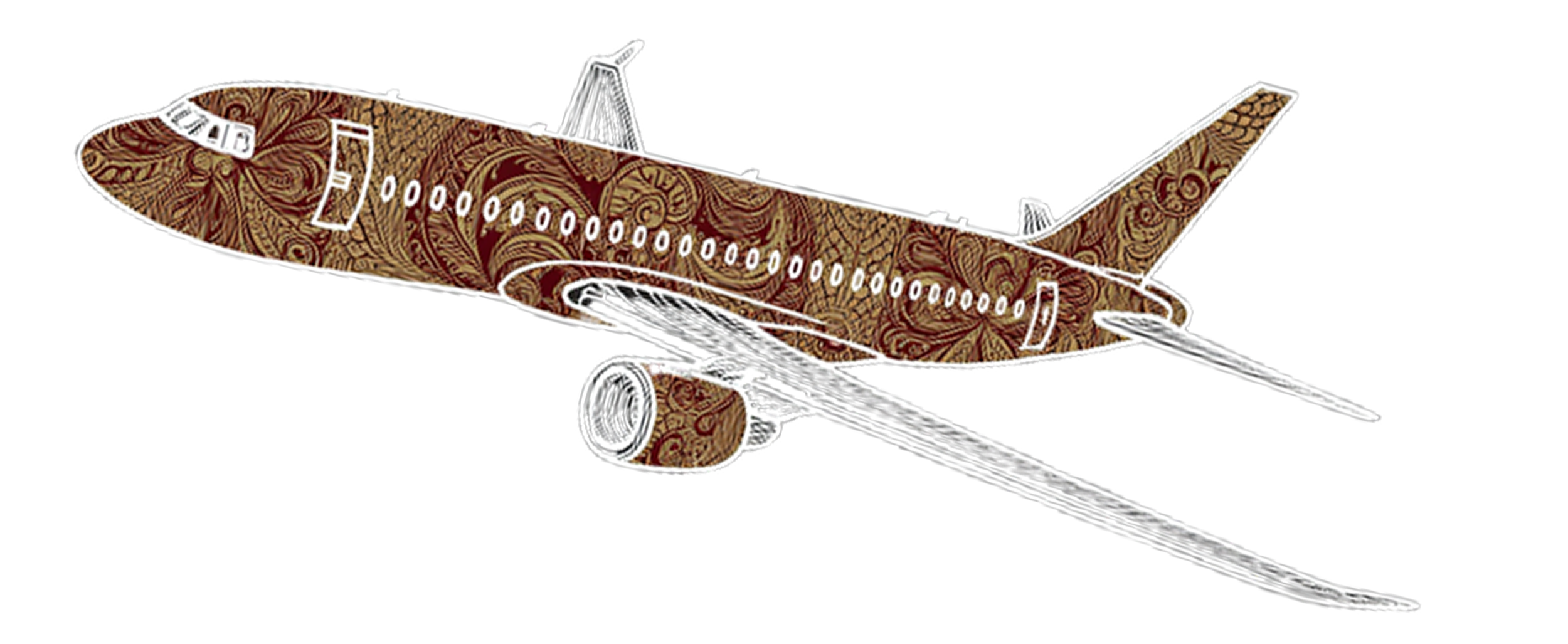
Private jet charter is a fragmented industry. Most bookings happen over the phone. The few digital options feel like filing a form, not booking a $50k experience.
Everything! Brand naming, visual identity, component design, React build, deployment. No team. No Figma handoff. Just a vision and a willingness to figure it out.
Skipped mockups entirely. Built a brand foundation first, name, palette, and typography, then went straight to React. The browser was my canvas.
A live, clickable luxury charter platform. 7-step booking flow with shared component state. And a new mental model for how I work as a designer.
01 — Problem
High-net-worth travelers don’t buy a seat. They buy certainty.
For clients spending $50k+ on a single flight, the experience should match. Existing platforms feel transactional and built for efficiency, not for the feeling. No one was delivering that digitally. Zenith Air is my attempt to close that gap.
“I’d never written a React component before this project!”
02 — Design Decisions
Three decisions that shaped everything.
Brand before code
Most digital luxury experiences default to dark. It's expected. I went the other way, a warm off-white base, deep charcoal text, champagne gold as an accent color. The goal is confidence; Old money.
Motion restraint
Every animation in Zenith Air follows one rule: slow down. Nothing snaps. Nothing bounces. Every element drifts in with purpose. Only the progress rail and content card animate. The header stays fixed since restraint is luxury.
Components talk
Pick Light Jet → passenger cap drops to 7. Choose Round Trip → calendar shifts to range mode. A share state create a coherent experience across 7 steps that flows through the BookingShell.
03 — Build Process
No Figma. No mockups. Straight to React.
I skipped Figma entirely and built directly in code. That’s uncomfortable for a UX designer. Sometimes there are gaps between designing in one medium and building in another, which results in a loss of time, fidelity, and intent.
So I started with a brand foundation and a component map. No mockups. No wireframes. The browser became my canvas.
Building the shell first
Every decision started with the BookingShell, the master container that everything else lives inside. Getting the wordmark, progress rail, and navigation right before touching a single form field was a discipline. It forced me to think about the whole experience before any individual step.
The moment that humbled me
The Jet Picker taught me something important about the gap between vision and execution. I knew exactly what I wanted: clean, solid jet silhouettes in champagne gold. The build came back sketchy and inconsistent three times in a row!
Instead of forcing it, I stepped back and found an SVG from a proper resource library. Knowing when to pivot for a solution and find a better path helped me move on. This taught me something important about the gap between vision and execution.
State as a design material
The most technically interesting moment was wiring the Round Trip toggle in step 1 to the calendar in step 3. When a user switches to Round Trip, the calendar shifts into range selection mode.
This meant components needed to share state through the BookingShell. As a UX designer, I've only built prototypes to show relationships. Now I was building it in code. The mental model was the same. The medium was different.
04 — What I Learned
The line between designer and engineer is getting thinner.
As a UX designer I mapped arrows between screens to show relationships. Now I build those arrows in code. The mental model is the same. The medium is different.
Constraints are generative. Building directly in React meant every design decision had to be buildable. No “we’ll figure that out in dev.” That accountability made me more precise.
Knowing when to stop pushing a bad solution is a skill. The jet silhouettes failed three times. I found better SVGs and moved on. It’s a quick design decision.
Shipping something real is more valuable than perfecting something that never launches. Zenith Air has rough edges. But it’s live, it’s clickable, and it taught me more in one project than months of mockups ever could.
05 — What’s Next
Phase 1 is live. Three more phases planned.
Client Booking Experience
Full charter flow: route, aircraft, catering, ground transport, confirmation. Live now.
Client Deepening
Saved profiles, preferred aircraft, booking history, real-time availability.
Operations Layer
Backend integration, data persistence, ops dashboard for the coordination team.
Full Ecosystem
Flight crew portal, broker integrations, analytics and reporting.