
2020
MINDFUL SPACE YOGA MEDITATION
ROLE
Fix Information Architecture
Create a better user flow
PROJECT DURATION
2 Weeks
BACKGROUND
Mindful Space's purpose is to provide yoga, meditation, and holistic services that support a healthy lifestyle in a friendly and positive way.
SCOPE
Create a better Information Architecture that helps users flow easily through the site. And provide as much information as possible regarding the studio and yoga practice.
TARGET AUDIENCE
25 years old and up. Novice and experienced yogis. Tech-savvy and not-so-tech-savvy.

01. DISCOVERY
• User Interviews
• Personas

02. DEFINE
• User Flow

03.IDEATE
• Wireframes

04.DESIGN
• Branding

05.VALIDATE
• Usability Testing
01.DISCOVERY


02.DEFINE

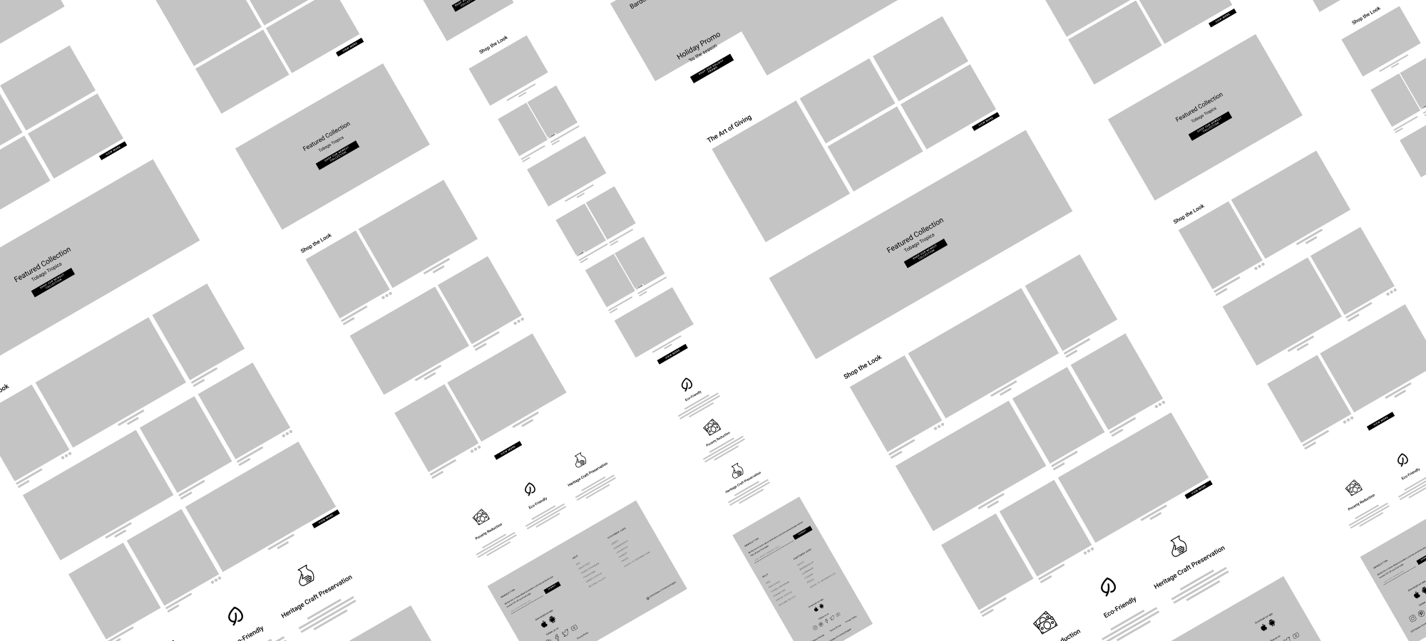
INFORMATION ARCHITECTURE
Using the findings from competitive analysis, I was able to organize information and understand how the users will make their way through the site while 1-on-1 interviews, have given me an insight of the emotional process of the users
Site map, task flow, and user flow were constructed in order to map out a
structure that is logical and is easy to navigate.
Snippet of the information architecture below

03.IDEATE

MID - FIDELITY WIREFRAMES
By referencing back to my research, persona, and IA, I was able to build responsive mid-fidelity wireframes and an overall layout for the site while keeping in mind the purpose of the business.
04.DESIGN

BRANDING
I create a mood board to reflect the stake holder adverbs: modern, minimal, and sustainable.
From there, I started sketching a few logos and decided on something minimal, easy, and resizable to fit a versatile environment and then developed a style guide.

HIGH - FIDELITY WIREFRAMES
During research, people are willing to pay a little more for quality and sustainability and AR features have positive feedbacks with
Concerns :
actual sizing and dimensions
how the product will actually look in the space
how to see the materials before purchasing
Designs were carried throughout desktop - tablet - mobile for responsiveness.

Responsive Home Page
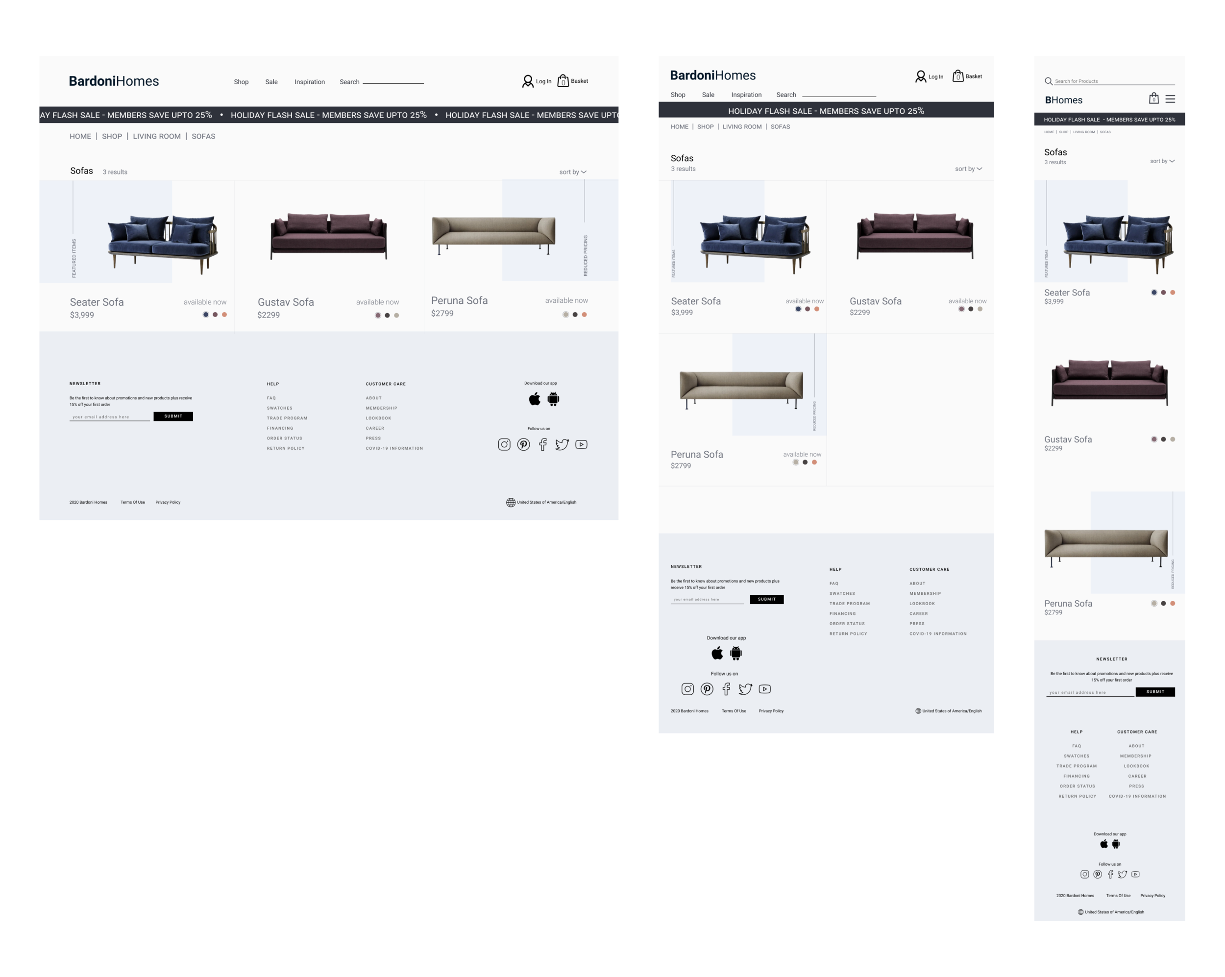
Responsive Search and Result Page
Responsive Product Page
05.VALIDATE

USABILITY TESTING
Conducted usability testing with high-fidelity prototype via Zoom to observe how users complete certain task.
RESULTS
Success:
100% of participant was able to go through site smoothly and easily and found the AR feature easily
Participants like the UI aspect of the project
Everyone thought that the AR feature is “so cool”
Doubts:
33% of participant did question the back end of AR after going through the prototype
no one clicked on the info icon and just went through the AR and dropped the furniture in place
ITERATION
Based on usability test finding, a step by step guide was added when clicking AR feature to force users to read through a quick instructions which can also be by passed for repeat users.
Hero image have been changed to communicate the brands identity. Icons that represent the brand have moved to the middle of the page to tell the brands story instead of starting with selling products.
see prototype below: