Main Navigation Redesign
Replaced a broken tab nav on a federal platform. Card sorting, 22 access levels, one clean dropdown.
The navigation had outgrown itself.
The platform's tab-based navigation had outgrown itself. Multiple rows of tabs consumed a significant portion of every screen. With 22 access levels and features still being added, and with no logical hierarchy, no room to grow, and no clear path for users to find what they needed.
The platform serves supervisors, administrators, and case workers. Each with different workflows. All navigating the same broken structure.
Three things were failing at once
-
01
Tabs misused as global navigation. They're designed for content switching, not system-wide wayfinding.
-
02
No hierarchy. Every item treated as equal regardless of importance or frequency.
-
03
No room to scale. Every new feature made the problem worse.


PROBLEM
Tabs-Based Navigation Increases Cognitive Strain
The UX team identified a critical structural problem: the platform's tab-based navigation had grown unmanageable. Spanning multiple rows of tabs, it consumed a significant portion of screen real estate. With 22 access levels and continuously expanding features, the navigation had no logical hierarchy, no room to grow, and no clear path for users to find what they needed.

The platform serves a diverse mix of users, including supervisors, administrators, and case workers, each with different workflows and access levels, all navigating the same broken structure.
UI Issues
Multiple rows of tabs consumed excessive screen real estate
Visual clutter and noise are competing with core workflows
Tabs are misused as global navigation, a component designed for content switching, not system-wide wayfinding
UX Issues
No hierarchy or categorization, as all items are treated as equal, regardless of importance or frequency of use
Cognitive overload from a flat, disorganized structure that offered no wayfinding support
Structurally unable to scale as new features and access levels were added
Design Goals
The team set out to replace a navigation pattern that had outlived its usefulness.
Establish a clear information hierarchy that reflects how users across roles navigate the system
Improve wayfinding and task completion by reducing the cognitive effort required to find anything
Reclaim screen real estate for the work that actually matters
Create a scalable navigation architecture that can absorb future growth without breaking
RESEARCH
Users Reveal the Gap Between Design and Reality
Reflecting Users’ Mental Model
To ensure the redesign was grounded in how users actually think and not assumptions, we chose an open card sort as the primary research method. With 16 participants drawn from actual platform users, the card sort was designed to:
Understand how users naturally group and categorize navigation items to align the new structure with their mental models
Inform labeling decisions so navigation language matches how users actually refer to features
Validate design decisions for menu groupings before committing to a direction

Surprising Discoveries
The findings were revealing, and in some cases, surprising:
Most users only see a fraction of the navigation. Due to access level restrictions, the majority of participants had never encountered many of the items they were asked to sort
Even power users with full access relied on the same few items. The full navigation offered far more items than users actually needed; most tabs were functionally invisible in daily workflows
Users provided clear labeling signals. Categories like "Management" and "Tasks" emerged organically from the sort. Where user language was ambiguous, the team iterated on labels, and post-design feedback from subject matter experts further refined the final terminology
A personalization opportunity emerged. Recognizing that users gravitate toward the same navigation items, the team designed a pinning feature to surface their most-used items. The feature was ultimately descoped due to development constraints, but it remains a strong candidate for a future iteration
I don’t know most of these tabs are
“
I tend to use the same [navigation] tabs for the most part
“
“
Supporting Research
Alongside the card sort, we conducted two additional investigations:
Data analysis examined user screen sizes, device types, and common entry points. Findings revealed a range of environments from ultra-wide monitors to dual screens to laptops, directly informing the responsive behavior of the new navigation
Information architecture audit by systematically logging into all 22 access levels to map every role's view. Conducted without direct user access due to federal constraints, this audit ensured the new navigation architecture accounted for every permission state across the platform
“
Identified Opportunities
From Findings to Design Direction
The research didn't just confirm the problem; it pointed directly to the solution. Five clear opportunities emerged from the card sort, IA audit, and data analysis:
Establish navigation around user mental models
Participants naturally grouped and categorized items that had previously existed as a flat, unorganized list of tabs. The new navigation needed to reflect how users think, not how the system was built
Build a scalable navigation architecture
The platform was still growing. The redesign was an opportunity to establish aclear, expandable structure that could absorb new features and access levels with a logical home for everything; something the tab-based system was fundamentally incapable of
Establish clear labeling using the user's language
Categories like "Management" and "Tasks" emerged organically from the card sort. When user language was ambiguous, iterations and subject-matter expert feedback refined the final terminology, ensuring labels would feel intuitive across roles.
Reclaim screen real estate
Multiple rows of tabs were consuming valuable workspace. The opportunity was clear: replace the tab pattern with a compact, structured navigation that returns space to the work itself.
Lay the groundwork for future personalization
Research revealed that users gravitate toward the same navigation items regardless of access level. A pinning feature was identified as a future opportunity to let users surface their most-used items; descoped for this iteration but documented for the roadmap.
DESIGN

Turning Research Into Design Decisions
With research findings in hand, the team translated insights directly into design decisions with each choice traceable back to what users revealed.
A key constraint throughout: the navigation had to work seamlessly across all 22 access levels, from supervisors with full system access to level 1 users with a limited view. No items were hidden or removed.

UX Improvements:
Reduced cognitive load by consolidating navigation into intuitive, research-informed categories
Scalable navigation structure with clear labeling that supports platform growth
Familiar interaction patterns with selected links open as tabs, keeping the experience consistent with the legacy system. Overflow tabs are captured in a "More" dropdown.
Consolidated navigation into a dropdown menu organized into clearly labeled groups informed by card sort results. The most frequently used categories, "Tasks" and "Management," remained visible at the top level for quick access
Card sort results directly informed labeling and categorization, and grouping items into intuitive categories reduced cognitive load and established a structure that can scale as the platform grows
Proactively surfaced hidden resources with links previously buried within tabs, such as a quick reference guide and direct support ticket submission, were elevated into the dropdown for faster access

Above view is a supervisor view with the most access to the navigation links
UI Improvements:
Smaller logo to maximize usable screen real estate
Dropdown menu consolidates navigation and streamlines the header
Consolidated icons grouped for visual clarity — surfacing features users didn't know existed
Iteration Process
The Final Design was Not the First Idea
Final draft was earned through multiple rounds of team critique and refinement.
Header layout
The profile icon was originally positioned at the far right, but a code constraint required the tablet component to occupy that position. The layout was adapted without compromising usability.
Dropdown structure
Went through 3 rounds of iteration, refining the grouping, labeling, and quick-access links before landing on the final structure
Visual treatment
Iterated on link styling, testing bolded and/or underlined variations before settling on a typographic treatment that balanced clarity with the existing design system.
Usability Testing
Users Made It Clear that the Design Held Up
Before the pilot launch, the team conducted a remote usability study with 12 users to validate the dropdown interaction, labeling, and the "More" overflow tab behavior. The results were unambiguous; users navigated confidently, and the design required no significant changes. The study didn't just confirm the direction; it gave the team the confidence to move forward.
I forgot about the old navigation, and I don't want to go back.
“
“
I use notification features all the time now. I didn’t know we had it.
“
“
This is easy to use and looks clean.
“
An unexpected finding: the cleaner header layout made the right-side icons significantly more visible. Several users discovered features they hadn't noticed before: "Is the notification new? I didn't know it was there." The redesign didn't just improve navigation; it surfaced functionality that had always existed but was never seen
“
Pilot Launch & Beta Test
A Staged Rollout to Protect a Mission-Critical System
Rather than pushing the redesign to all users at once, the team proposed a staged rollout, approved by stakeholders, beginning with 5 locations before expanding the platform across all users. For a heavily used federal system, a careful launch wasn't just smart, it was necessary.
Timebox the rollout per location to prevent disruption to active workflows
Validate the information architecture against real user expectations in a live environment
Ensure technical stability by identifying and resolving bugs in real time as the rollout expands
Gather qualitative insights to fine-tune the experience before scaling
Give the training team time to prepare user guides and support materials
Beta Testing in the Wild
During the pilot, the team facilitated live usability sessions with beta participants using realistic tasks based on common platform activities. Observers tracked time to destination, misclicks, and moments of uncertainty — and participants were asked whether each label contained the expected topics and whether the information architecture matched their mental models.
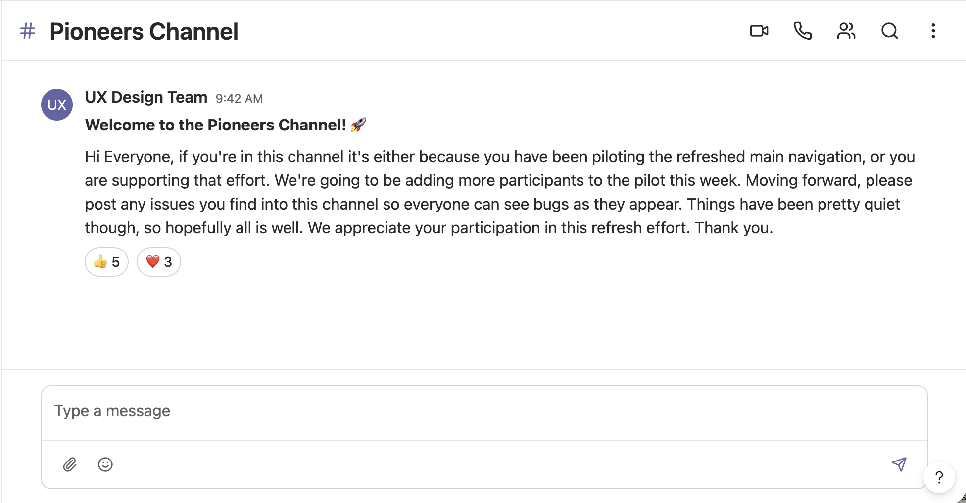
To keep feedback flowing in real time, a shared Microsoft Teams channel was created for beta participants, the UX team, and the development team. This allowed users to surface issues as they encountered them, keeping the entire team aligned and enabling the team to resolve bugs before wider release.
-
The original project was completed for a government agency. To respect confidentiality, this case study presents a recreated version that captures the core work and insights. Plants felt like the right cover, who doesn't like plants? ☘️ Happy to share more details in a conversation.
-
Not at all! An entirely new design system was created for this presentation. Different color combinations, different aesthetic, but the same UX thinking underneath.
-
Good observation. Tabs are still needed, each represents a single task page that users toggle between to complete their workflow. What changed is the scale and noise. The tab row is now limited to one line with a "More" dropdown handling overflow. Cleaner, but still familiar.
-
Due to code constraints, the tablet component needed to be positioned at the far right, for now. It's on the radar for a future iteration.
IMPACT
They love it, and the Data Agreed!
The redesign launched platform-wide across a nationwide system, and the response was clear. Adoption wasn't just high, it was sustained and grew over time.
7,040 users transitioned to the new navigation, tracked through New Relic SQL queries run
An initial 7% opt-out rate effectively disappeared over time
By the end of the rollout, only 2 users remained on the old navigation
The impact went beyond adoption metrics. The cleaner header layout had an unexpected effect, and consolidated icons became significantly more visible, surfacing features that had always existed but were previously overlooked.
The redesign didn't just fix navigation, it made the entire platform more discoverable.
What It Made Possible
A scalable navigation architecture with a logical home for every current and future feature
Reduced cognitive load across 22 access levels
A documented personalization roadmap with the pinning feature remains a strong candidate for future iteration
LESSONS
What stays with me
Collaborate with developers early. A late-discovered code constraint required reworking the header layout. On complex federal platforms, technical limitations are part of the design brief, not an afterthought.
Reducing visual noise surfaces more than you expect. The redesign unintentionally made notifications significantly more visible. Good information architecture doesn't just organize content; it makes the whole platform more discoverable.
A clear roadmap is a design tool. Without one, cross-team conversations are scattered across design and development topics, slowing everyone down. A structured phased plan improves prioritization and cross-team clarity.
Enterprise UX demands system-level thinking. This wasn't just a visual redesign; it required deeply understanding a federal platform with 22 access levels and designing flexibly enough to evolve over time.